
From the 1967 self-titled debut to his final masterpiece Blackstar, The Press puts their spin on the album artwork of every David Bowie album, including some honourable (and dishonourable) mentions.

Bowie’s albums were never just about the music. They concurrently explored new ways of looking at things, experimental and brave, while showcasing the dramatic look and personas he projected throughout his entire career, the covers often defining and enhancing the music and concepts of those very albums; elevating the sleeve design to the status of high art.
When combining all of Bowie’s official and non-official albums over the course of six decades, it’s an expansive body of work to draw on from this quintessential artist who was always different and ever-surprising. All of the studio albums, selected live outings and other Bowie miscellany are included in this Bowie sleeve art list, and all based purely on the aesthetics of the album cover.
HONOURABLE MENTIONS
These records deserve a special mention as being visually impressive: the handsome, Warhol-inspired Sound & Vision (1990) Rykodisc box set was beautifully designed by Roger Gorman and features various Bowie guises incorporated into a futuristic overlay; so too the scraggly bearded character depicted on the cover of the excellent Baal (1981) is dark and menacing in tone, suitable for the character he plays in the BBC drama.
The Space Oddity-era image gracing his first ever compilation The World of David Bowie (1970), has a backlit, wild-eyed image of a young Bowie overlaid with the tracklisting. Bowie revisits his The Man Who Sold the World/Hunky Dory-era look on the cover of his triumphant live return to Glastonbury 2000 (2018), while the quirky New Zealand chart-topper Chameleon (1979), has its charms and a timeline of sorts on the back.
-web-2018")


DISHONOURABLE MENTIONS
Less effective are these album sleeves, with special shout out to the truly hideous cut and paste job on the atrocious revision of Changes (1990), more designed for compact disc, however the worst ever Bowie cover is the spooky child-man mashup of Toy (2021), unapproachable, defying explanation. Controversial artist Jonathan Barnbrook’s adequate Best of Bowie (2002), their first collaboration, is a cliched photomontage of various Bowie guises, and the 1991 re-release of Station to Station flirted with the full-sized colour artwork initially rejected by Bowie for the sky looking too artificial. The cropped photo and the monochrome visuals of the original 1976 cover has since been reinstated over the coloured impostor.
Parlophone’s covers are mostly pedestrian (eg: Welcome to the Blackout and I’m Only Dancing), and the live double album of the ’74 Los Angeles gig, Cracked Actor (2017), is no different. It pairs a bad photo with a pasted-in transparent rehash of the Diamond Dogs logo seemingly straight from beginners guide to Paint. Elsewhere the long-forgotten Bowie Rare (1982), and the cartoon design for Images 1966-67 (1973) by Neon Park known for his artwork for Frank Zappa’s Weasels Ripped My Flesh, are very much of their time.
 (2017)")


THE BOX SET SERIES
So far five posthumous box sets (except for 2015’s Five Years) have been released by the David Bowie organisation, and these extensive Parlophone “era” packages are expertly compiled career overviews. However the artwork is mostly direct minimalism adequately representing each era yet displaying little artistic flair deserving of the great man. An off-centre, semi-rare snap accompanying skew-whiff Frutiger lettering does not a great cover make, although the magnificent Brilliant Adventure (2021), featuring Bowie’s own striking artwork and Egon Schiele influence, proves powerful.
")

")
")
_Cover_Art")
ALBUM COVERS | RANKED
32. The brightly coloured, vibrant design for Reality (2003), was created by Johnathan Barnbrook who packaged the album covers for Bowie’s last four LPs. On this occasion, in collaboration with graphic artist Rex Ray, Barnbrook depicts Bowie as an anime-style character reflecting movement, the idea that reality had become an abstract concept. Regrettably, given the competition, Reality takes the prize for the worst Bowie studio album cover of all.

31 – 28. Bowie chastised David Live (1974) upon it’s release claiming he’d never listened to it, even describing it as the final death of Ziggy: “My God, it looks like I’ve just stepped out of the grave. That’s actually how I felt. That record should’ve been called ‘David Bowie is Alive and Well and Living Only in Theory’.” Considering how scary and emaciated Bowie looked at the time, the David Live cover certainly encapsulates exactly that.
The Mick Haggerty designed Let’s Dance (1983), is much more inviting. It boasts a funky ‘bow-tie’ font and had a newly tanned, gloved Bowie presented to his newfound everyman audience. That was the intention for Black Tie White Noise (1993) too, focusing on an extreme Nick Knight close-crop portrait of the star’s face, a bit like a magazine cover, although it could’ve been so much better, while Tin Machine II (1991), found Bowie having an appendage-related run in with the US censors, requiring its manly genitalia to be airbrushed out by British designer and co-creator Edward Bell.


27. For the double live album Stage (1978), producer Tony Visconti meticulously recorded and presented the songs in chronological order, thankfully the correct performance order was reinstated when the album was re-released in 2005. A great live album, tour, and ensemble, including the core rhythm section of guitarist Carlos Alomar, bassist George Murray and drummer Dennis Davis, and augmented by guitarist Adrian Belew and ex-Utopia keyboardist Roger Powell, the album unfortunately suffers from pedestrian and unimaginative packaging, only using the one photo throughout. The cover shot of Bowie in front of a large cage of tube lights is duplicated on the rear, and those hoping for an incredible world tour montage of our hero at his peak, were sadly disappointed when the inner gatefold reproduced the same photo yet again, but bigger.


")
26. The debut album David Bowie (1967), featured a fresh-faced mod-Bowie head-shot inside a thin blue border, the singer wearing a tailored high-collared jacket looking like he’s posing for his school yearbook photo. The overall effect and cool lettering, not to mention being released on the same day as Sgt Peppers, did not help sales, and the image and album is time-stamped in the mid-60s.

25. The provocative original Mercury UK sleeve for the hard rocking The Man Who Sold the World (1971), had the former mod now looking like a world-weary Hollywood starlet reclining on a chaise lounge wearing a dress. More effective when released worldwide by RCA in the wake of Ziggy-mania in 1972, was the black and white ‘Ziggy kick’ album cover, with the preposterous essay on the back.
Originally titled Metrobolist, the random US version designed by Mike Weller was a cartoon of John Wayne with an erased speech bubble that originally said “roll up your sleeves, take a look at your arms” (removed for its drug reference), standing in front of the Cane Hill asylum where Bowie’s schizophrenic half-brother Terry had been committed.


24. This album was originally released as his second self-titled album in 1969, and featured an image of Bowie’s disembodied head slapped over Hungarian-French pioneer and leader of the Op Art movement Victor Varasely’s space-age, blue bubble artwork. The RCA edition re-titled Space Oddity (1972), using a great Mick Rock photo from Haddon Hall in Beckenham, complete with spacey typehouse font and Bowie’s own alien image, worked just as well.


23. Busy and comical, the album cover to Never Let Me Down (1987) complemented the pop-rock calamity contained therein. The cover is a checklist of lyrical moments on the album and the circus-style backdrop would be the central on-stage theme for the supporting Glass Spider tour. “There’s a vaudevillian thing about the cover” Bowie said at the time, and multiple 7″ singles deployed various outtakes from the same photo shoot. Pleasingly, the 2018 Never Let Me Down remix from the Loving the Alien box set had a brand new stripped back image and production to match.


22 – 20. The “cell” portrait is now the official cover for The Buddha of Suburbia (1993), originally released displaying a montage of characters from the TV series of the same name. This stark update uses a simple dreamlike Outside-era photo by Frank Okenfels. For the cover of Outside (1995), Bowie own self-portrait in charcoal suitably accompanies the murky art rock contained in the grooves of the record.
Lodger (1979), inspired by Egon Schiele’s self-portraits, is a bizarre postcard gatefold featuring a full-length Brian Duffy photo of Bowie as accident victim, contorted with a broken nose and bandaged hand, balanced on a steel frame. Also something of a homage to Roman Polanski’s psychological thriller The Tenant, a professional hi-res image was passed over at the last minute for a Polaroid of deliberately low resolution.


19 – 16. The commanding minimalism adorning the cover of Bowie’s final masterpiece Blackstar (2016), was designed by regular collaborator Jonathan Barnbrook and features a giant black star with fragmented stars spelling out BOWIE beneath. It is one of the few Bowie albums not to feature an image of the singer, and brings a sort of finality and a darkness representative of the music contained within. Barnbrook’s Heathen (2002), incorporates upside-down Priori typeface, used for the first time for commercial purposes, over a satanic image of Bowie with digitally enhanced eyes. “The design of the album plays on the anti-religious meaning of Heathen”, said the designer.
The lenticular graphics on the cover of Hours… (1999), was designed by Rex Ray with photography by Tim Bret Day and Frank Ockenfels. It filters a vivid blue 3D wash over two images of Bowie: one, a modern day long-haired David holding a broken, older version of his past self, a nod to Michelangelo’s La Pietá perhaps, and the ethereal sleeve for his experimental Earthling (1997), matches the electronic textures dominating the music. It finds Bowie decked out in Alexander McQueen’s tattered Union Jack long coat overlooking Earth’s grand beauty, chiming in perfectly with a UK enthralled in all things Britpop at the time. David was not shot in the UK however, it was New York where photographer Ockenfels took the photo, and designer Dave De Angelis was responsible for placing Bowie in front of the English evergreens.


")
")
15. Bowie requested Barnbrook design the cover art for his comeback album The Next Day (2013), so he took the cover of his 1977 masterwork “Heroes”, and placed a whopping great white square over the top of it, obscuring the photograph, on top of which is the album title underneath the older LP’s stricken-through name. Bowie was back! Virtually unseen for almost 8 years, January 8, 2013 was the earth-shattering announcement: new single, video and album… still hard to believe now.
Harder to believe was the album packaging. Daring and irreverent, the cover is a lesson in conceptual provocation and minimalism and for an artist who had spent so many years reinventing his image, here he helped us to reinvent our expectations of what album covers could be. The concept and album itself confirmed Bowie as the enigmatic artistic juggernaut he was, and with such bold packaging he seemed to be challenging everyone and everything, including himself.

14. One of the first ever covers to feature Bowie posing with his band (he didn’t even do this with the Spiders), the sleeve for Tin Machine (1989) was designed by Roger Gorman (Sound + Vision) and was released with alternative arrangements of Hunt and Tony Sales, Reeves Gabrels and Bowie for the cassette, CD and vinyl (below) editions. The photographer was Masayoshi Sukita (“Heroes”), and the stark image used for Tin Machine’s debut reflected the new era in Bowie’s musical evolution.

13 – 11. The sleeve design for Bowie’s pop detour Tonight (1984), was created by Mick Haggerty who had previously worked on Let’s Dance. Bowie’s brief to Haggerty was for a very heroic and exotic image, referencing the Green Lady by Tretchikoff. Tonight certainly owes a clear debt to British artists Gilbert and George (specifically Faith Curse), as it depicted a blue-tinted Bowie before a stained-glass effect oil painting, with roses and lilies amid the bold brush strokes. Tonight’s bold palette artwork is striking even if the album was widely regarded as a stopover album.
The Young Americans (1975) sleeve was based on Toni Basil’s image on the cover of a Sept ’74 edition of After Dark magazine. David saw the cover photo and said ‘that’s what I want for my next album cover’, duly inspiring him to commission the photographer Eric Stephen Jacobs to shoot and airbrush the glamorous wedge-cut image. The cigarette smoke was drawn in, and a black photo-album border adds to the sublime effect.
For Hunky Dory (1971), illustrator Terry Pastor was asked to do the artwork for the album. Pastor colourised a black and white Brian Ward photo of Bowie in a Marlene Dietrich pose. He used an airbrush and transparent inks and finished it of with retro-font title lettering Letraset (a rub-down transfer lettering that was widely used in the 70’s). Bowie was so pleased with the results, the following year he commissioned Terry to design and colour the iconic Ziggy Stardust album cover using the same technique. Terry reddened the musician’s lips, painted his long hair yellow, and added some eye-shadow.

")

10. The glammed-up 60s covers album Pin Ups (1973), featured a masked Bowie with ‘it-girl’ supermodel Twiggy, photographed by her then-manager Justin de Villeneuve, with makeup by the brilliant Pierre La Roche. Taken during the Pin Ups sessions, intended for a fashion magazine cover, Bowie liked the photo so much he decided he’d rather use it for his own album.
“When I showed Bowie the test Polaroids, he asked if he could use it for the Pin Ups record sleeve. I said: ‘I don’t think so, since this is for Vogue. How many albums do you think you will sell?’ ‘A million,’ he replied. ‘This is your next album cover!’ I said. When I got back to London and told Vogue, they never spoke to me again.” – Justin de Villeneuve

9. David Bowie’s legendary farewell concert of 3 July 1973, in which he famously broke up the Spiders From Mars on stage at the Hammersmith Odeon in London, was released a decade later as the soundtrack to DA Pennebaker’s concert film Ziggy Stardust The Motion Picture (1983).
The deathly image gracing the cover was designed by Alexander Da’Lama with photography by Nick Sangiamo, and while it appears to be conceived on a budget of approximately two pence, it still seems under-appreciated both as a double live album of Bowie in his glam rock pomp, and as a classic Bowie album sleeve. It features a visually stunning deconstruction gatefold of Ziggy burning to cinders.


8 – 7. The stark minimalism of Station to Station (1976), uses a Steve Schapiro photo taken on the set of Nicolas Roeg’s sci-fi drama The Man Who Fell to Earth, of Bowie as lead character Thomas Jerome Newton stepping into an alien environment. Bowie took the persona with him. The Thin White Duke was an icy, severe character dressed in a white shirt, black trousers and a waistcoat, appearing to look more “normal” than some of his other alter-egos, red hair slicked back, with a menacingly distant air about him; he used German Expressionist film and art to inspire his look and subsequent white light stage shows. The cover’s heavy white border clashes with the red lettering that squeezes all the words onto one line with no separation between title and artist, and all in uppercase.
The same stylish layout was replicated for the Changes One (1976) compilation, which uses a glamorous photograph by famous American photographer Tom Kelley, who snapped Hollywood celebrities in the 1940s and 1950s including Marilyn Monroe. This Greatest Hits package cemented Bowie’s stardom, hitting top 10 on both sides of the Atlantic, but he would soon decamp to Berlin to reinvent himself as an experimental, electronic art-rocker.

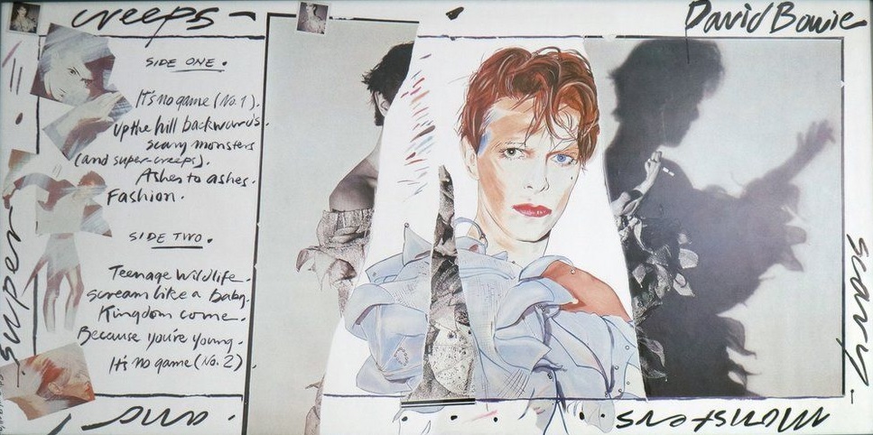
6. The superb collage for Bowie’s rock-opus Scary Monsters (and Super Creeps) (1980), was rendered in combination with a Brian Duffy photograph of Bowie in the Pierrot costume, designed by Natasha Korniloff, and a painting by British artist Edward Bell. At the photo shoot Bowie initially posed as the perfect Pierrot, although throughout the session he dismantled his look until he was reduced to a dishevelled, smeared, smoking clown.
Much like the Lodger shoot the year before, Bowie had employed Duffy as the photographer in collaboration with a graphic artist. The back of the sleeve references his three previous albums, and Aladdin Sane’s legs (another Duffy photo), summing up the decade nicely. Bowie would wear this outfit in the ground-breaking Ashes to Ashes video, and the influential New Romantic guise drew from his earliest costume experience when he starred in Lindsay Kemp’s Pierrot In Turquoise in the late-60s. A number of photos from the shoot were also featured on three different covers for the Ashes to Ashes 7″ single, the image becoming the dominant visual representation of his Scary Monsters phase.
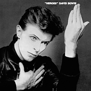
5. One of the more famous images in pop culture is the “Heroes” (1977) album cover. Shot by Japanese photographer Masayoshi Sukita, and inspired by the painting Roquairol by German painter Erich Heckel, the stark black and white image strikes a similar pose to that of Iggy Pop’s The Idiot of the same year, also influenced by Heckel. Complete with its distancing ironic quotation marks, “Heroes” was Bowie at his artistic zenith. With the cocaine paranoia of Los Angeles receding, he had perfected the icy gaze and still had an air of menace about him, before turning all smiley and tanned in the 80s. The “Heroes” cover was famously revisited for the 2013 comeback album The Next Day.
4. The iconic artwork to the breakthrough The Rise and Fall of Ziggy Stardust and the Spiders From Mars (1972), helped contribute to the Ziggy-mystique with its tinted 50s sci-fi comic look that captures the defiant, jump-suit-dressed, extra-terrestrial rockstar Ziggy having just fallen to Earth. The street is the dark and empty Heddon Street in Soho, Central London, that Bowie and photographer Brian Ward visited one cold and rainy night in January 1972.
Influencing a generation of pretty things, Terry Pastor colour-tinted the black and white photograph of Bowie wearing a green jumpsuit, later featured in a performance on BBC music show The Old Grey Whistle Test, and was hand coloured to appear blue on the sleeve. This instant masterpiece shows Ziggy, guitar in hand, with one knee raised up and resting on a box, the cold, dark and damp street symbolising the bleakness of the apocalyptic concept behind Stanley Kubrick’s A Clockwork Orange, and projecting the atmosphere of William Burroughs’ Wild Boys.

3. Like the previous album Station to Station, a Steve Schapiro still from The Man Who Fell to Earth was used for the cover of Low (1977). With its low-profile visual pun and Bowie’s orange hair fading into the gloriously futuristic burnt-orange background, Low was the first instalment of Bowie’s celebrated Berlin trilogy and has rightly been hailed as one of the greatest albums, and covers, of all time.
His songwriting on Low tended to deal with difficult issues. Many of the songs, where there was singing, concern lethargy, depression, estrangement, or self-destructive behaviour, mostly delivered in an atypical monotone vocal. As hauntingly futuristic as the music itself, the cover perfectly blends many aspects of photography, design and the integration of colours between the text, the back drop, and Bowie himself.

2. The mercurial image of a shirtless Bowie adorning the cover of Aladdin Sane (1973), complete with a blue and red lightning bolt painted across his ethereally white face, has become one of the most recognisable and ubiquitous images in rock today. The result of a collaboration between make-up artist Pierre Laroche and photographer Brian Duffy, Bowie’s flame haired character Aladdin Sane, described as “Ziggy goes to America”, is airbrushed to the point where you’re not sure if it’s a painting or a photograph.
A teardrop loosely positioned on his clavicle adds to the drama; eyes closed and mouth slightly agape, he projects flamboyance and charming intrigue. The enduring glam-rock image has now become something of a cultural icon and can be found on fridge magnets, caps, calendars, t-shirts, lamps, sneakers, and beer mats, but the visual impact of this creative masterpiece is undeniable, and has become the defining look of Bowie’s long career.

1. “Bow-wowie. It’s superstar David painted half dog!” screamed the headlines in 1974. Belgian painter, illustrator and comic artist, Guy Peellaert had achieved a degree of fame in 1973 after publishing a best selling book called Rock Dreams, fantasising on unearthly and surreal images of contemporary star idols, in a combination of photomontage and painting. Among its fans were a plethora of celebrities, including Mick Jagger, who commissioned Peellaert to work exclusively on The Rolling Stones’ 1974 album It’s Only Rock and Roll, a fact he mistakenly mentioned to Bowie. You snooze you lose. Peellaert’s art for the Orwellian masterpiece Diamond Dogs (1974), came out in April, six months before the Stones album. “You wouldn’t wear a new pair of shoes around David”, so said Jagger.

“…it’s an artist from Belgium called Guy Peellaert, who did a book called ‘Rock Dreams’ that I nicked. Well, I didn’t nick the book, but I saw the book at Mick Jagger’s house and I nicked the idea of doing a cover.” – David Bowie 1974.

Peellaert’s tableau featured a flame-haired, half-man/half-dog Bowie, portrayed as a sphinx-like creature with emaciated features and a hard-to-miss canine penis. Even his hands and fingers have the appearance of paws, whilst behind this monstrous figure are two female, human-canine grotesques based on Alzoria Lewis and Johanna Dickens who were billed as The World’s Strangest Family in a variety show in Coney Island, New York from 1930s – 1950s.


Bowie wanted to be photographed in the style of French dancer Josephine Baker based on a photograph of her in 1926 where she appeared lying on the ground and posing like a wild animal. The painting gave the album a startling visual impact, which had been such a feature in Bowie’s recent work, and one that stood out on record shelves. Best described as pop surrealism, the cover conveys a glam-tinged, post-apocalyptic mutant freak show, with just a hint of mayhem.

The original gatefold sleeve showed the hybrid creature’s full genitalia which ran afoul of U.S. censors in 1974, who required the artwork to be airbrushed out, but surviving original versions have become sought-after collectables. Accompanying this image was the inner gatefold featuring a dreamlike montage of a cityscape perceived through a haze of deep burnt yellow, accompanied with the lyrics to the album’s opening track, ‘Future Legend’.

INTRO Picture by Claude Verheyen. Amsterdam 15 October 1977.

Another great Bowie piece Pierce! For me it’s Low, the artwork set as my Steam profile picture on the day he passed away, it will stay that way.
I remember a while back some wag posted a meme of the Low album artwork with Bowie’s head set further down, the title of the album: Lower 🙂
Thanks Chris hope you liked it, thanks for checking it out.
One thing I can say…Bowie never repeated himself in anything…including album covers. Great writeup…most of these if not all are iconic.
I agree Badfinger, but some of the times his experiments didn’t work for me, but that is the nature of experimentalism, and Bowie is one of my favorite artists of all time.
I know they are not really similiar but they are in a changing way…Neil Young also forged ahead for better or worse through parts of his career.
My favorite era of Bowie is the early seventies…the Life On Mars and Ziggy era.
I personally didn’t like the Ashes to Ashes period…and that is because….although I grew up in the 80s… just didn’t like the 80s sound. I’m an old soul I guess.
Great stuff Rilaly, I wonder which ones don’t work for you, feel free to share.
Thank you Max, and thanks for reading. Bowie’s cover are all pretty good, really.
Great list sir. I do love that Diamond Dogs cover. I would say your Top 5 are perfect. Outside of that, he has some strange covers and they could go anywhere on that list.
I agree. Diamond Dogs is the weirdest, best cover Bowie ever put on an album. I loved Low and Lodger too, once I learned the story behind Lodger.
They are all great those ones you mention. He seemed to work with some designers and photographers multiple times.
Yes DD had always stood out for me as one hell of an album cover. The top 5 or so are no-brain-ers aren’t they. thanks for reading buddy.
This is a fantastic look at Bowie’s LP covers, and the links all seem to go to interesting appendices, too. Thank you!
Hope you liked it Phil, and thanks for reading. I tried not to stuff it full of too many links, but hope you had fun reading.
A brilliantly-written and exhaustive article as always Pierce!
Very kind of you Jeff, much appreciated and as usual thanks for checking in.
Brilliant post!
Thank you Jadi 🙂
Excellent write up and much appreciated the time it must have taken you to put this together. I can’t disagree with you on your top choices. Bowie’s creativity and his ability to find artists to reflect his wishes for the album covers has brought a lot of joy to the world. I really liked learning everything in this post about the covers, many of which were new to me.
thanks msjadeli and yes it took a while, I had to make sure I hadn’t got anything too horribly wrong. A lot of research and years of reading up on DB helps. I’m so glad you checked in and enjoyed it, thank you!
You are very welcome.
I have not seen anything quite like this, very well done!
Thank you for reading Randy. Feel free to share.
Wow, quite an impressive undertaking to review and rank all of these album covers. I have to admit I get quickly challenged when it comes to ranking stuff. Perhaps, I also overthink it. With that being said, I think I can get behind your no. 1 choice. I was also glad to see my favorite Bowie album “Ziggy Stardust” came in pretty high!
Thanks Christian, I definitely overthought it but pushed on regardless. Ziggy is right up there with my favourite Bowie album ever as well. thanks for checking in buddy.